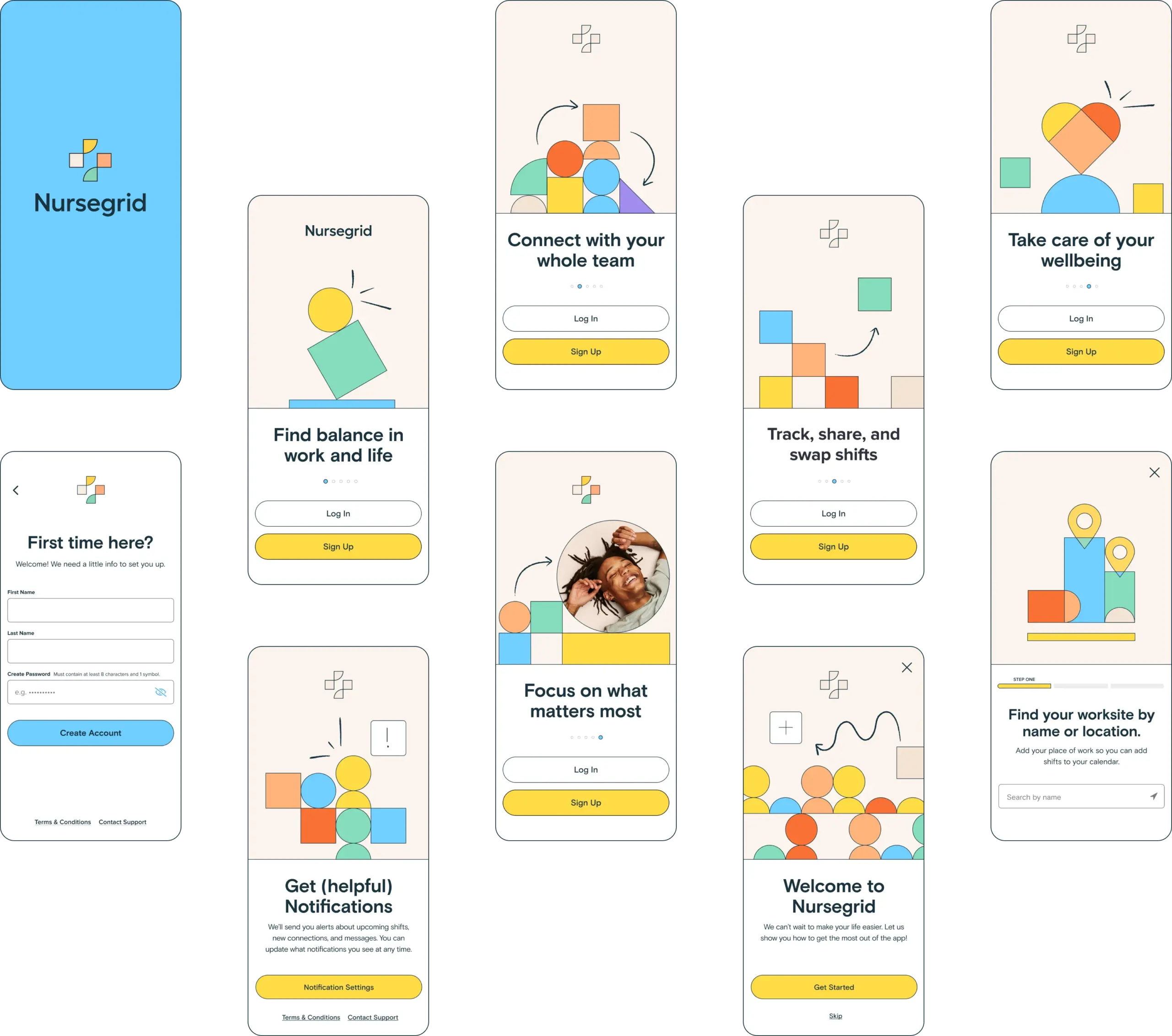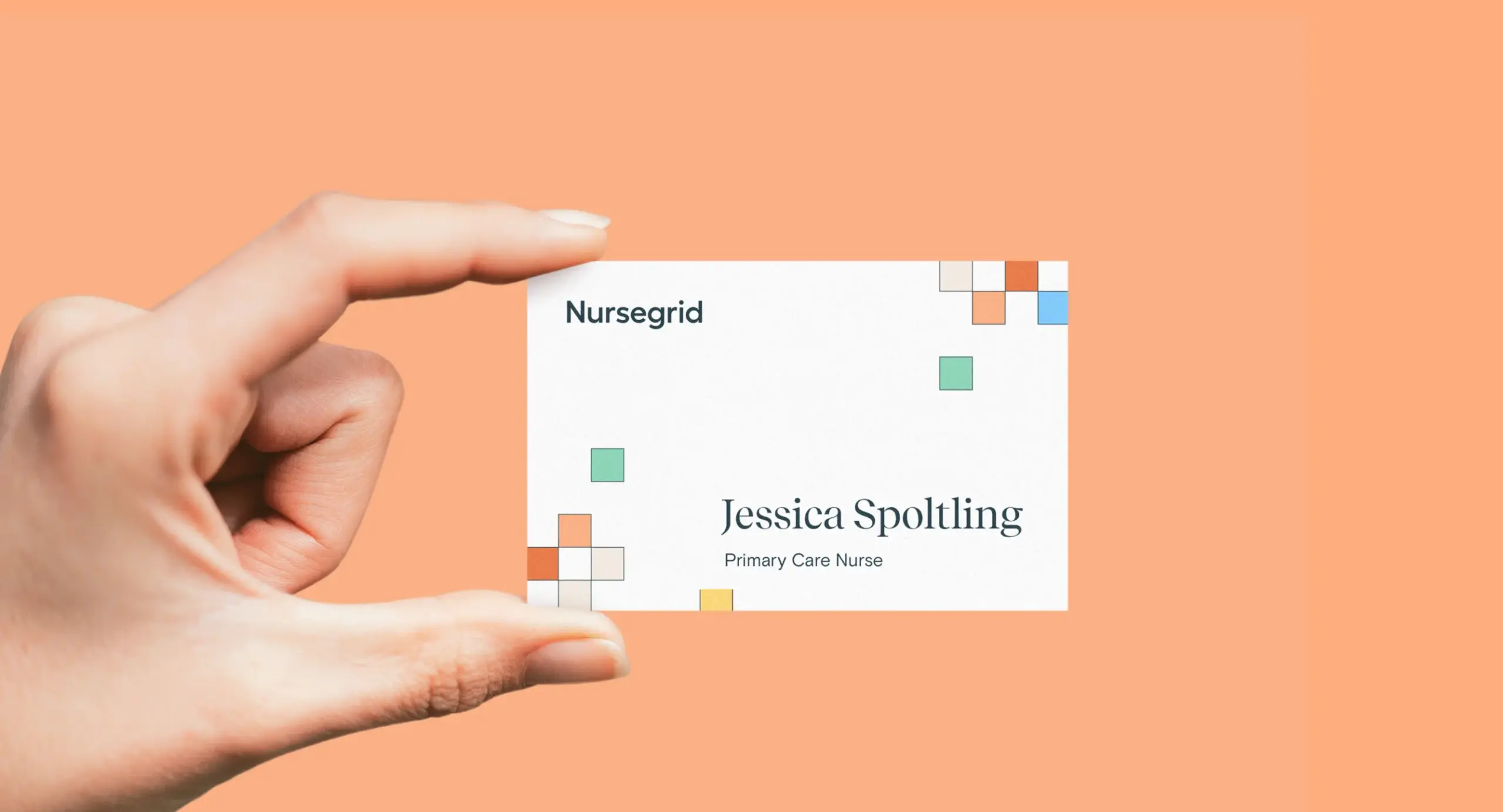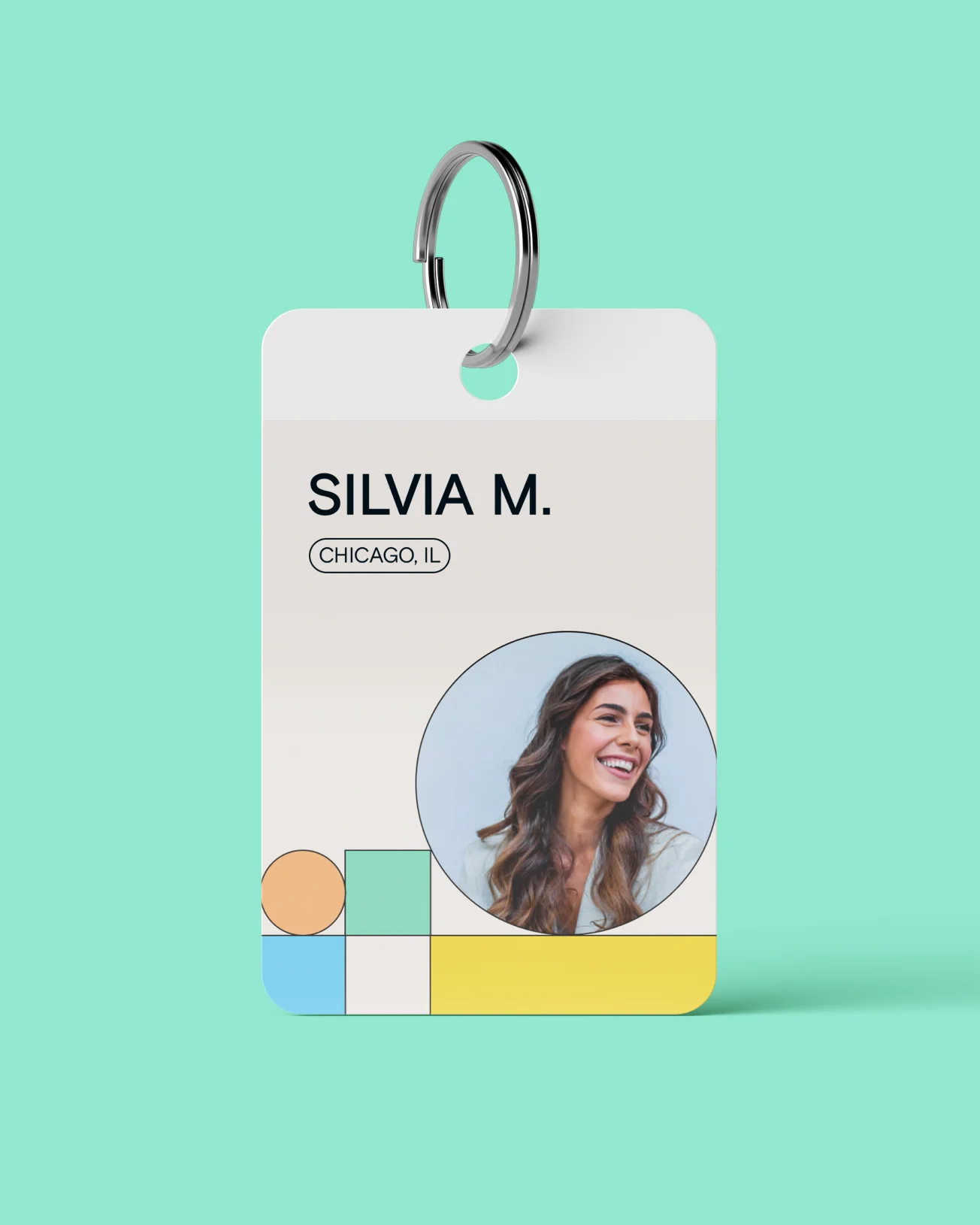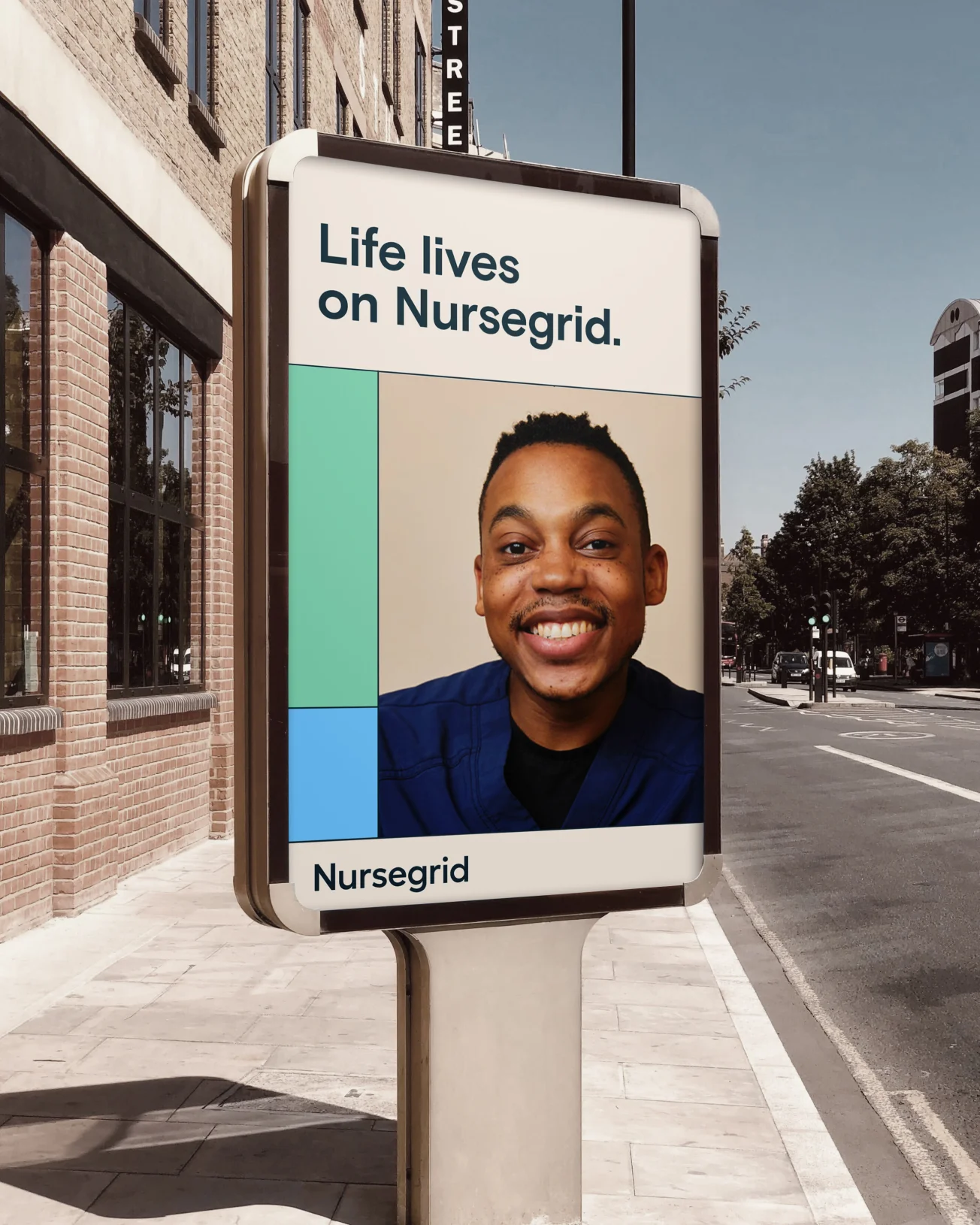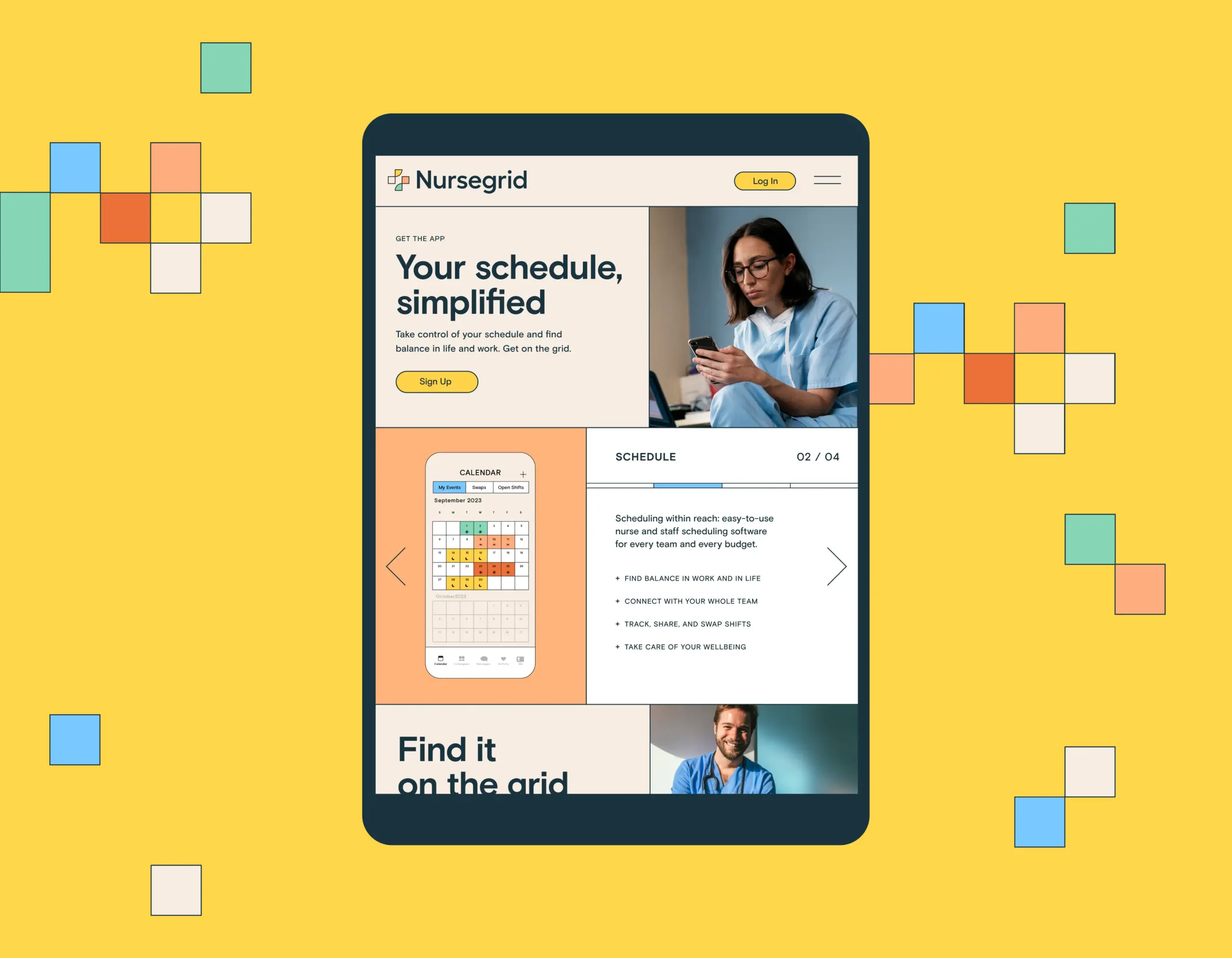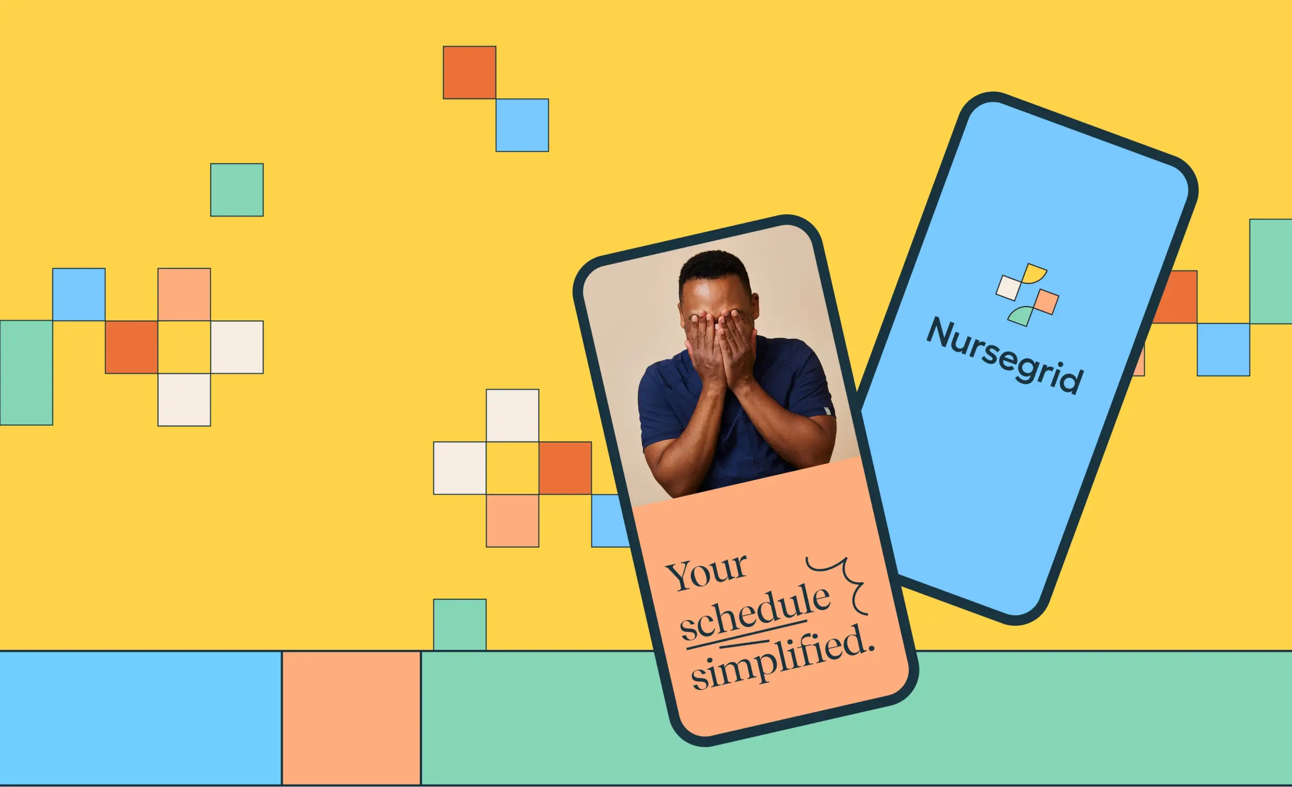
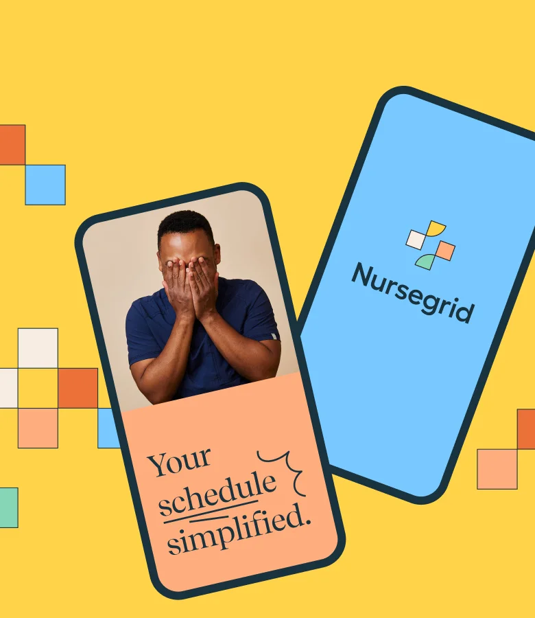
Nursegrid, the #1 calendar app for nurses, is used by thousands of nurses daily to manage schedules and connect with their teams. While the app continues to grow in popularity among its target audience, the company wanted to stay ahead of the curve. They connected with Anchour for a new messaging POV and visual identity, topped off with a refined app UX.
Industry
Services Provided

Time to get fluent
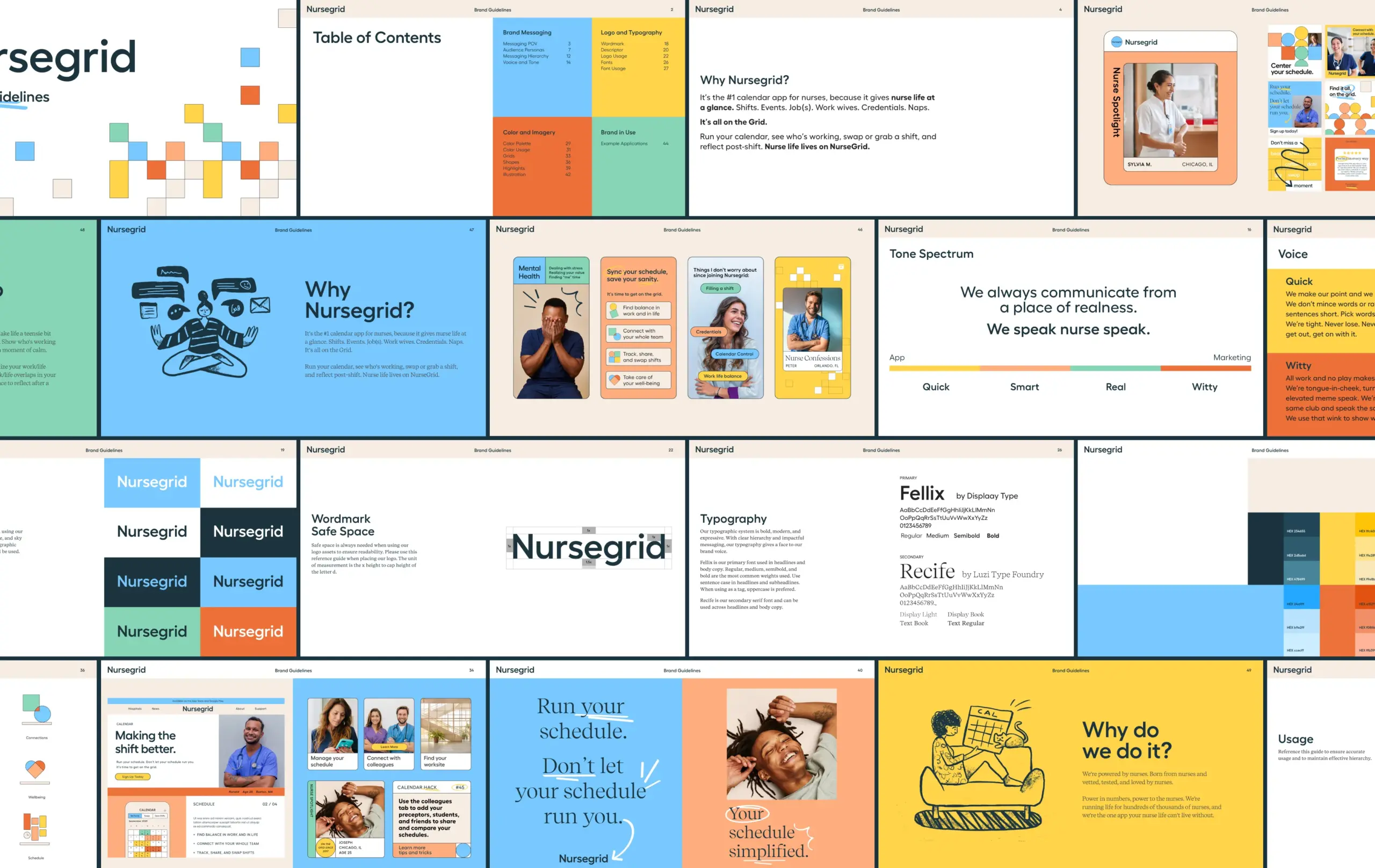
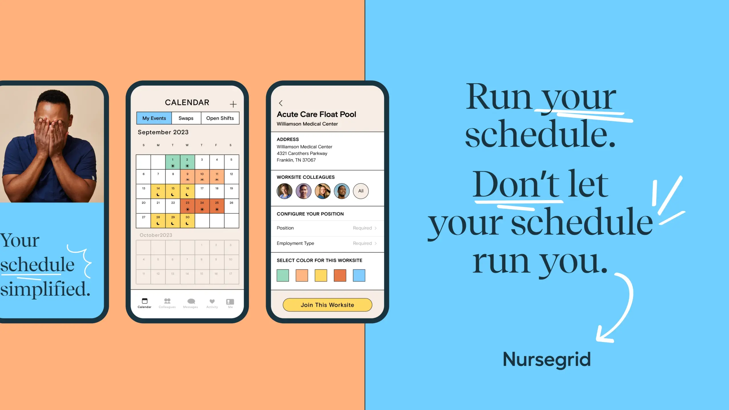
To get started, our team studied up on nurse speak via popular profiles on TikTok, landing on a young, tongue-in-cheek voice to bring to the brand. We’d then match that energy to the visual identity, bringing the brand’s new verve to life in an updated digital experience.
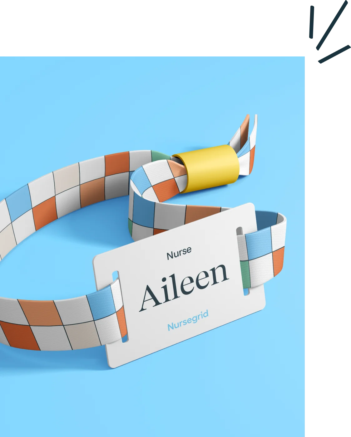
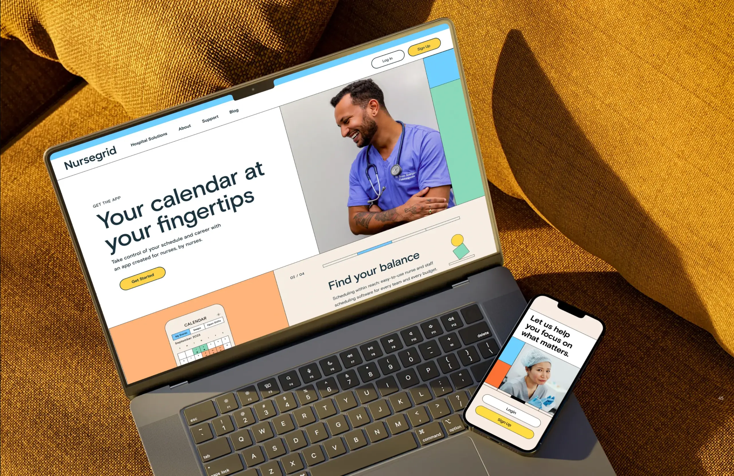
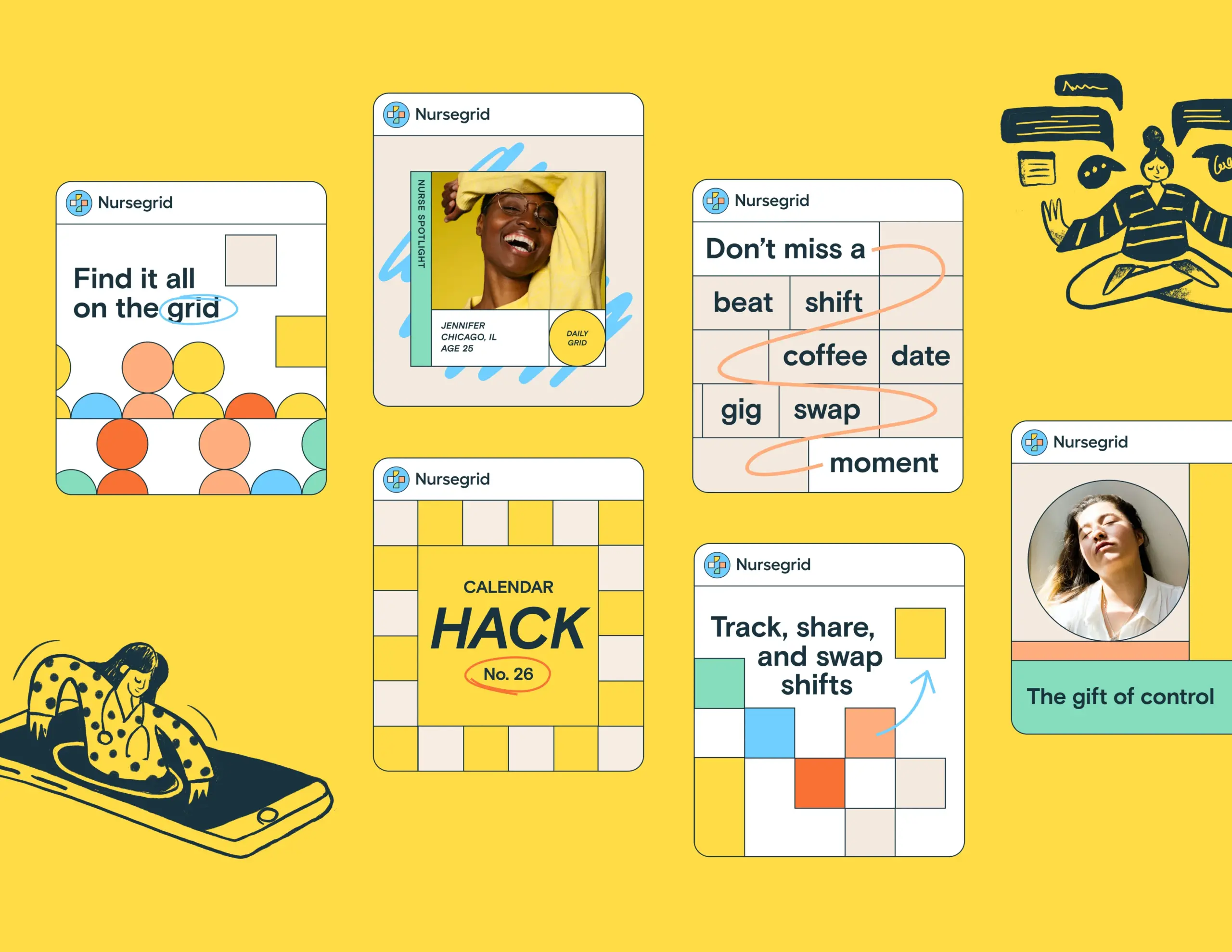
It’s all on the grid
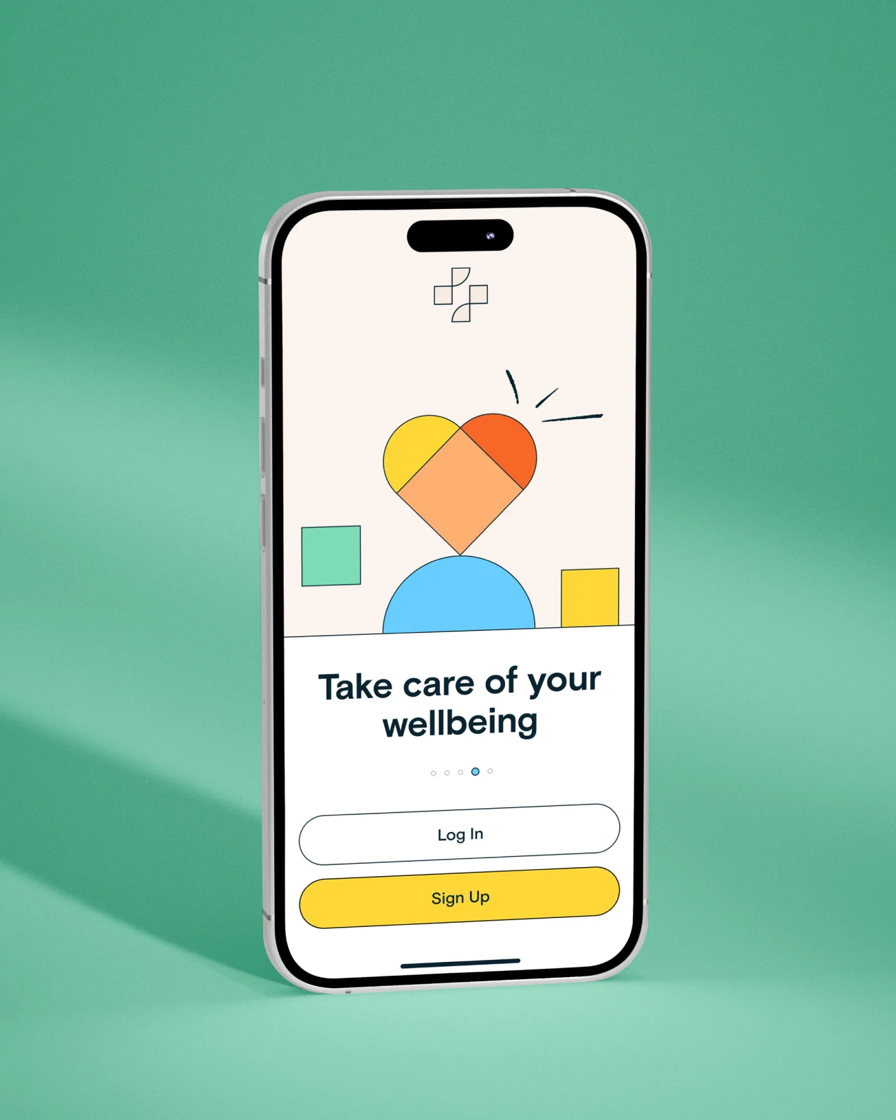
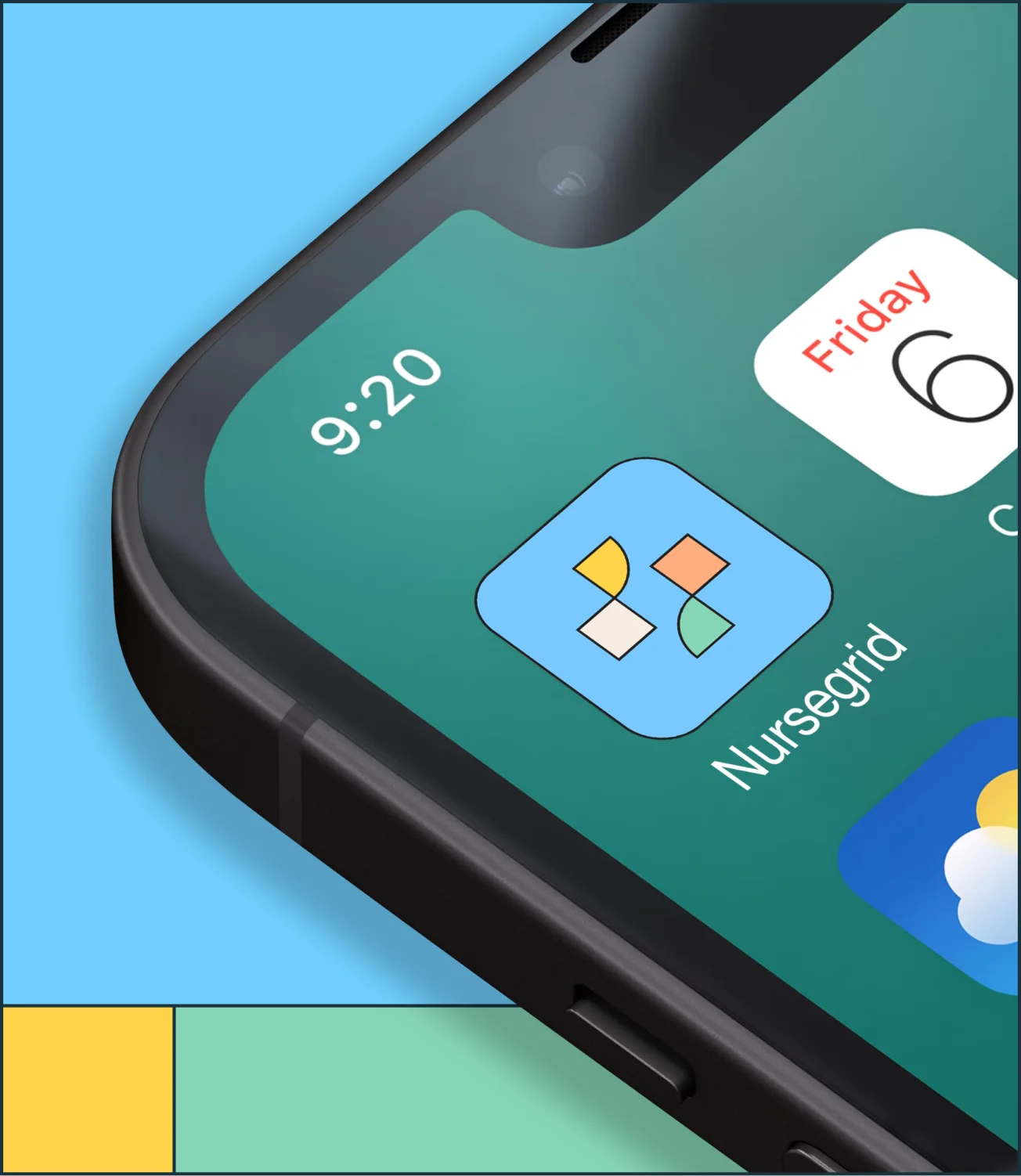
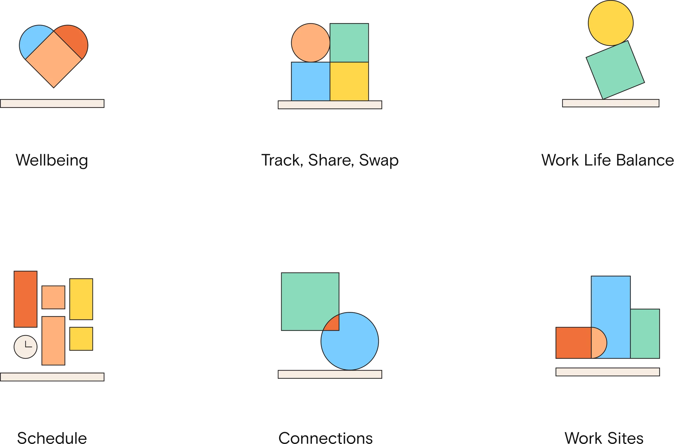
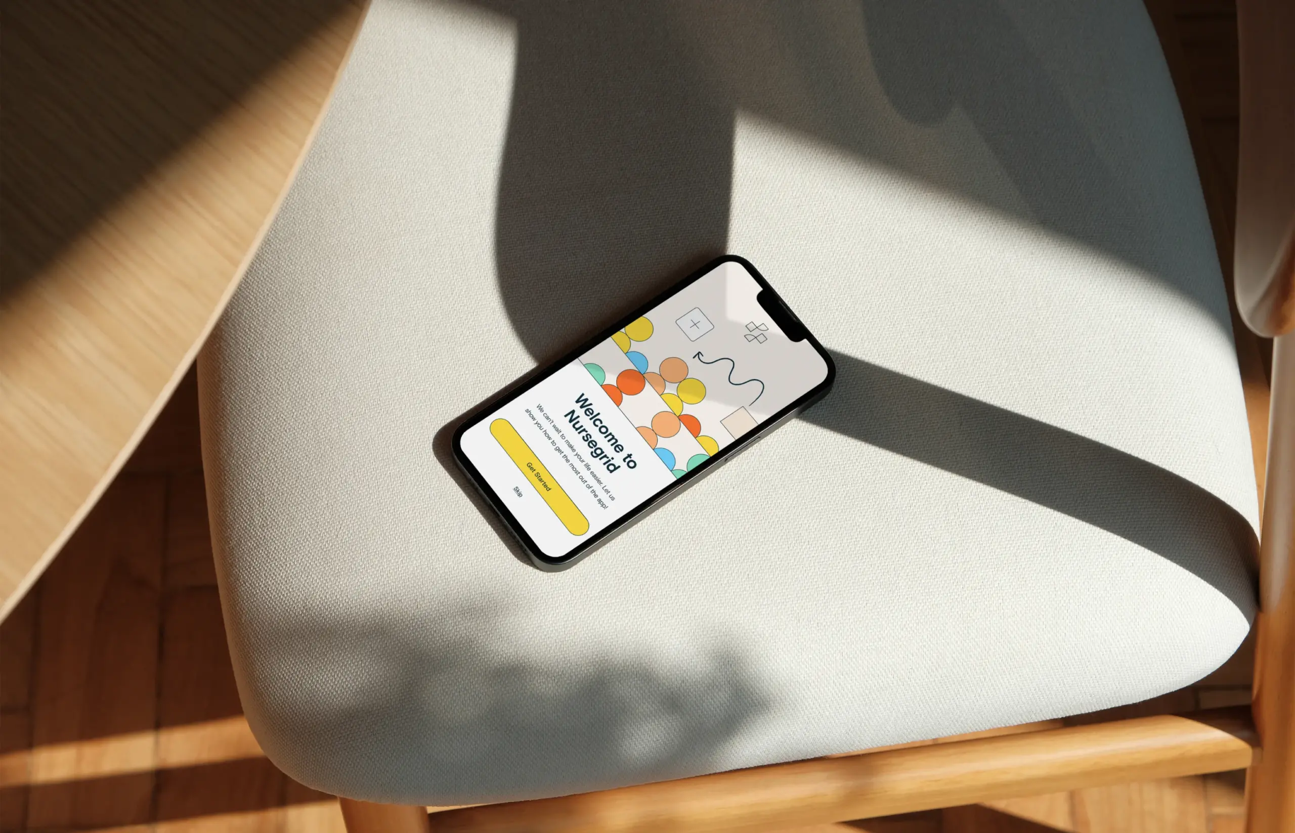
We dialed in voice and tone, ready for brand expansion. Then design leaned into the “grid” with a design structure that stayed loyal to the brand name, but brought a fresh color palette and structure that can be flexible to modern applications. Moving into the app’s UX, we streamlined the process to join and made functions simple and intuitive. Nurses have places to be and people to help, so we wanted them to be able to get in, get out, and get on with their lives.
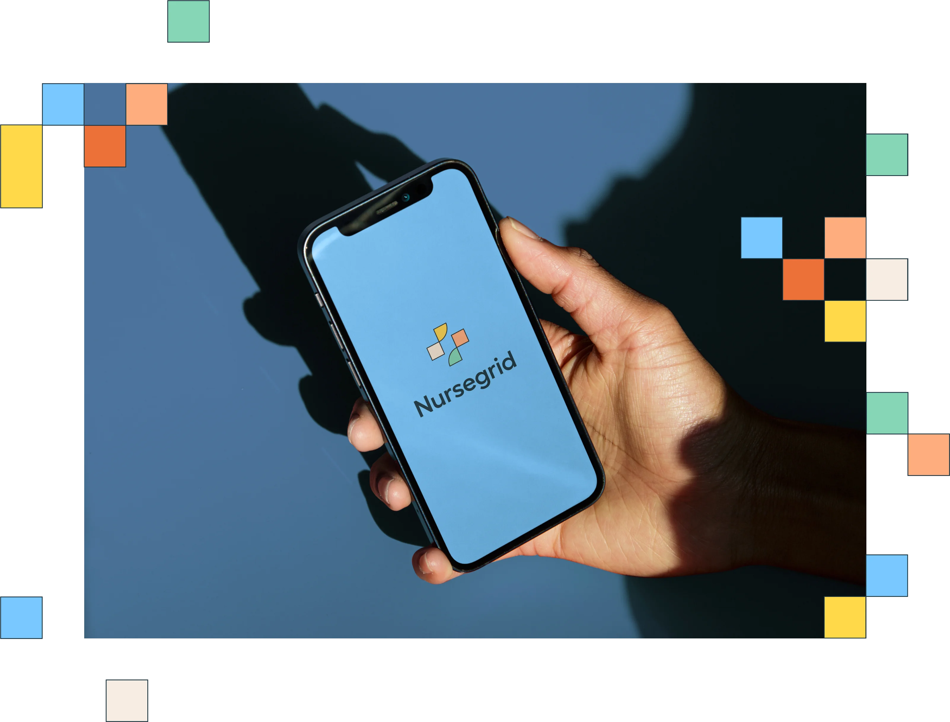
Building real connection
The upgraded app proved to be a hit with its target audience, retaining existing users and ramping up new customer acquisition. The fresh look and tone brought an authentic, cheeky perspective to the brand that users found immediately familiar. Today, Nursegrid is an essential tool that’s lighthearted, smooth, and a simple reprieve for the nurses using it daily.
